6Structure Reveals Insights
Establish Structure
Now that you’ve created meaningful messages, how do you arrange them for maximum impact? You structure them in a deliberate and logical way. A solid structure is the foundation of a coherent presentation, and shows the relationship between the parts and whole. It’s similar to the couplings on a train or the string of a pearl necklace; it keeps everything connected in an orderly fashion, as if the content were destined to fit together neatly within a given framework. Without structure, ideas are easily forgotten.
“It’s unwise to merely dump a pile of unstructured information into the laps of your audience. They will have the same reaction as if you take a watch apart, fling the pieces at them and say ‘Here’s all you need to make a watch.’ You might get high marks for research and energy, but that is a low-class consolation prize. By doing this you confess that you don’t know what to do with all the stuff you’ve dug up. Audiences expect structure.” H.M. Boettinger1
In general, most presentation applications prompt users to create slides in a successive order. This linear approach naturally focuses the user’s attention on the details of the individual slides rather than the presentation’s over-arching structure. To make sure your audience will “see” the structure, eliminate these linear constraints and create an environment that lets you view your content spatially.
There are several ways to do this. You can use sticky notes, tape slides on a wall, or lay them on the floor. Any method that pulls your content out of a linear presentation application will work. Moving out of a slide-creation environment helps identify holes and keeps you focused on the bigger picture. This will help move your presentation from being about a bunch of small parts to being about a single big idea.

Clustering your content helps you visually assess how much weight you’ve given to various portions and how many supporting points you need to get your message across. Use this technique to confirm that you’re emphasizing the correct content and allocating appropriate time for each message.
Keep in mind that the structure should accommodate the audience’s comprehension needs, and be assembled in a way that’s palatable to them. It’s natural for subject matter experts to prepare material linking ideas that are
closely connected in their own minds, but remember that the audience might not see these relationships as readily. Connect your messages in a way that your audience can follow. The structure should feel natural and make common sense to them!
In this section, you’ll walk through a variety of structural devices to help organize your presentation. Structural problems are the most common cause of failure in presentations. If the structure works, the presentation will work. If one is sound, the other will be sound.
Make Sense
The odds are high that you’ve been the victim of a meandering presentation. Unorganized presentations follow an invisible, neurotic pathway that only makes sense to the presenter. When an audience is unable to recognize structure, it’s usually because the presenter either didn’t have time to organize the information or didn’t care enough to package the content in a way the audience could easily process.
Without structure, your ideas won’t be solid. Structure strengthens your thinking.
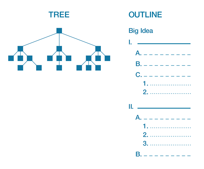
The most widely used structure for presentations is topical. A logic tree and outline are common forms to help visualize structure.
Notice how all the supporting information hangs off the larger topics. Points are held together under one unifying big idea from which the topics cascade down.
I recently talked to the Chief Marketing Officer of a public company about the way she had modified her process for developing messages for her CEO. In the past, she and her team had always used slide shows to “pitch” ideas to the CEO. Inevitably, after three or four slides, he would derail the process by complaining that some particular piece of content was missing. His pet content was there, which he would have seen it if he’d held onto his shorts—but that would have meant waiting through fifteen more minutes of slides. With a laugh, she shared a monumental idea her team had come up with. Instead of slides, they presented him with a detailed outline. He quickly grasped its structure and immediately spotted his pet content. He then went on for the rest of the hour, building on the team’s ideas. Long live outlines!
There are benefits to looking at a presentation’s structure holistically.
- It creates a snapshot of the structure so you’re looking at the whole and not the parts, which keeps you focused on the construct instead of the details.
- It ensures that you have one clear big idea bolstered by supporting topics.
- It filters out tangential subtopics that may fall within the topic but that don’t purely support the single big idea.
- It helps the review team get a quick read on the structure and messages, saving them time so they can give more thoughtful feedback.
Organizational Structures
Most presentations use a topical approach to organizing their supporting content, but there are other, less customary organizational patterns that can be used to structure a presentation. You can use these patterns to create your overarching structure or to organize content within a subtopic.
These four structures have a natural, storylike form that creates interest in presentations:
- Chronological: Arrange information related to events according to their time progression (forward or backward). This is best used if a topic is generally understood in terms of when events transpired.
- Sequential: Arrange information according to a process or step-by-step sequence. This is usually used in a report or to describe a project rollout.
- Spatial: Arrange information according to how things relate together in a physical space.
- Climactic: Arrange information in order of importance, usually moving from the least to most important point.
These four structures have contrast inherently built into them and work for persuasive presentations:
- Problem-solution: Arrange information by stating the problem and then the solution. Establishing that there’s a problem helps convince people of the need for change.
- Compare-contrast: Arrange information according to how two or more things are different from or similar to one another. Insights surface when information is put into this context.
- Cause-effect: Arrange information to show the different causes and effects of various situations. This is effective when promoting action to solve a problem.
- Advantage-disadvantage: Arrange information into “good” or “bad” categories. This helps the audience weigh both sides of an issue.
Select your organizational structure based on which one makes the most sense to support your big idea. But whichever you choose, be sure to guide your audience as you go through it, using verbal or visual cues to let them know where you are and where you’re going.
Case Study: Richard Feynman
Richard Feynman’s lectures at the California Institute of Technology appealed to both the heady physics majors and non-physics majors who simply dropped in to his class for fun (an unprecedented phenomenon for a physics class). Feynman’s accessible communication style earned him the title The Great Explainer.
Feynman once explained the theory behind his lecturing style in an interview with the BBC: “How should I best teach them?…[F]rom the point of view from the history of science or the application of science? My theory is…to be chaotic and confuse it. Use every possible way of doing it. You catch this guy or that guy on different hooks as you go along. So during the time the fellow who is interested in history is being bored by the abstract mathematic…the fellow who likes the
abstractions is being bored by the history. You do it so you don’t bore them all, all of the time.”2
The contrast in Feynman’s lectures stemmed from an analytical side and an emotional side that were both highly developed. In addition to winning a Nobel Prize, designing a visual representation for subatomic particles, participating in the development of the atomic bomb, and predicting nanotechnology, he also played the bongo drums on a regular basis. The asset he prized most was the boundless curiosity his father instilled in him. “My father taught me to notice things,” Feynman said. “I’m always looking, like a child, for the wonders I know I’m going to find.”3 Feynman taps the emotions of humor and curiosity again and again to present a view of science that’s both balanced and fascinating.
Feynman communicated from both his head and his heart in each lecture.
Analytical Devices:
- Signal: Feynman uses organizational signals to help the students understand how the structural pieces of a lecture fit together. He states the structure at the beginning and uses rhetorical questions and verbal signals when transitioning to new points.
- Itemize: He breaks some sections into chunks by stating how many points he is going to make and then articulating what point he will be covering as his lectures progress.
- Visualize: Feynman regularly used 35mm slides, overheads, and the chalkboard, but he didn’t overuse them. He used dramatic gestures and sound effects to accompany his lectures instead of blackboards covered with esoteric symbols.4
Emotional Devices:
- Wonderment: Feynman’s child-like curiosity drove him toward science while also influencing his lectures with poetic phrases of wonderment, not only for science, but for life. Feynman didn’t just talk about physics; he marveled at the subject, and the magnificent beauty and brilliance of nature.
- Humor: Feynman had a self-deprecating sense of humor and a knack for weaving in humor related to the subject matter. He knew that an entertaining story is often more readily received than a well-reasoned lecture.5 He interjected humor in almost even increments across his lectures.
The sparkline that follows reflects Feynman’s ability to employ the power of contrast.
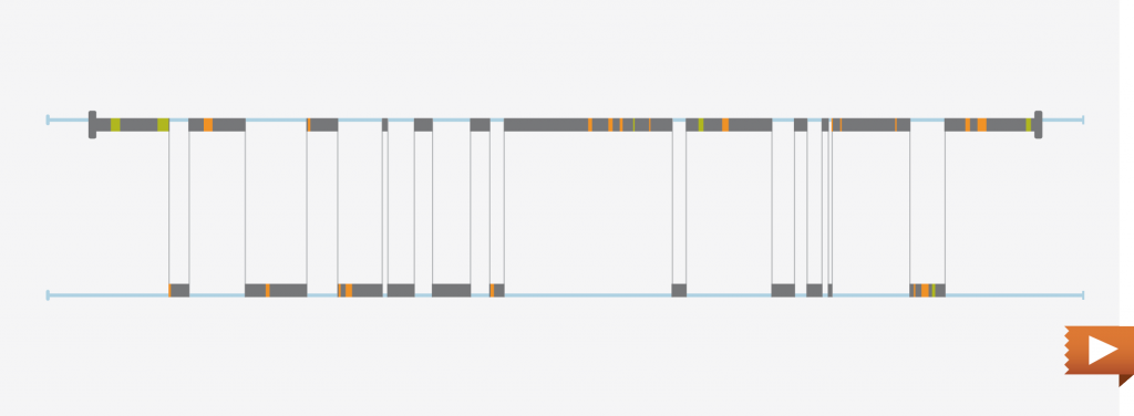
Gravity Lecture Sparkline
As you’ve learned, contrast is critical to holding an audience’s attention. Feynman’s lectures are a magnificent example of contrast and structure. Some academic topics simply can’t contrast between what is and what could be until they lay the foundation of what is over several lectures.
In this lecture on the Law of Gravity, Feynman masterfully incorporates contrast by moving back and forth between fact (mathematics) and context (history) in nearly perfect timing. Technically, this sparkline should be one flat what is line. So we’ll pretend we’ve zoomed in on that line to look more closely at the contrast between fact and context.
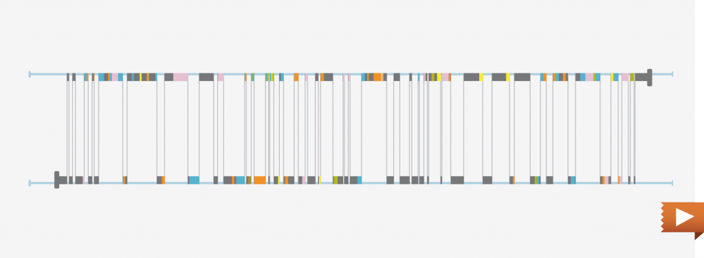
There’s Plenty of Room at the Bottom Sparkline
Richard Feynman delivered this groundbreaking speech at a lecture to the American Physical Society at Caltech. It gained international notoriety for its innovative perspective on atoms and their potential to become machines. Feynman’s famous technical speech has a tighter frequency than most non-technical presentations.
He moves between the laws of physics what is and those laws applied at the subatomic level what could be.
Order Messages for Impact
You can use structure to drive a desired outcome. The way you associate pieces of information with one another influences their meaning and determines how your audience receives them. Skillful arrangement of information builds emotional appeal that greatly increases the impact of your presentation.
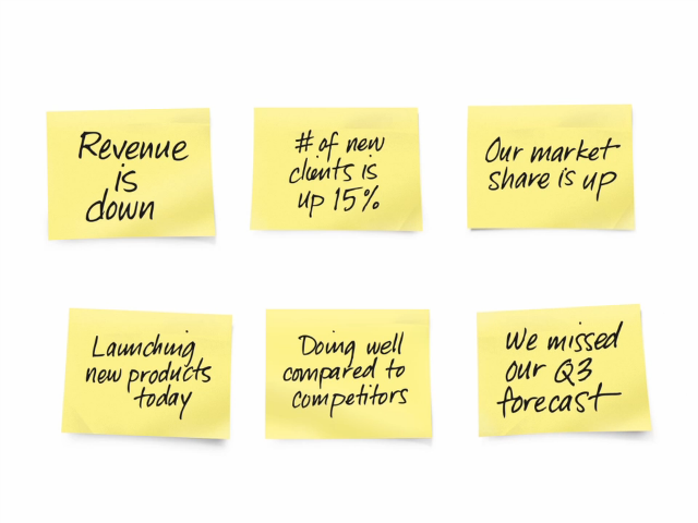
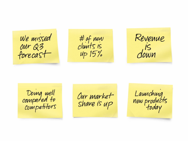
A typical quarterly update presentation is portrayed in the following videos. These types of reports are regularly used by organizations to communicate the progress achieved in meeting corporate goals. Note that the “MOVE TO” conveys confidence of success, and that employees should feel motivated to help achieve it.
The way information is structured makes a difference in the outcome.
Create Emotional Contrast
Audiences enjoy it when presentations convey emotional contrast and appeal; however, most presentations lack this because it requires an additional step and can be an elusive element to include.
Involving the audience emotionally helps them form a relationship with you and your message.
According to Peter Guber, “Business leaders must recognize that how the audience physically responds to the storyteller is an integral part of the story and its telling. Communal emotional response—hoots of laughter, shrieks of fear, gasps of dismay, cries of anger—is a binding force that the storyteller must learn how to orchestrate through appeals to the senses and the emotions.”6
Alternating between analytical and emotional content is another way to create contrast. Remember, if you want to keep your audience interested, contrast is key.
Presentation Content Types
Below are two columns listing typical presentation content. Hard drives around the world are packed with slides from the left-hand section, but only a tiny percentage have slides from the right-hand section.
| ANALYTICAL CONTENT | |
|---|---|
| Diagram | Specimen, exhibit |
| Feature | System |
| Data | Process |
| Evidence | Facts |
| Example | Supporting documentation |
| EMOTIONAL CONTENT | |
|---|---|
| Biographical or fictitious stories | Shocking or scary statements |
| Benefits | Evocative images |
| Analogies, metaphors, anecdotes, parables | Invitations to marvel or wonder |
| Props or dramatization | Humor |
| Suspenseful reveals | Surprises |
Look at any of the analytical topics from the list on the left. They typically have no emotional charge to them—neither pain nor pleasure. Yet all could be presented in a way that transforms traditionally analytical material into emotional material. For example, a simple diagram of a small circle within a larger circle could convey that an acquisition occurred. The diagram is neutral until you tell the story of the struggle it took to acquire the company, or the heroics displayed by both parties to expedite the acquisition. Data is purely analytical until you explain why the ups and downs exist.
Contrast Analytical and Emotional Content
Let’s review the Q3 update presentation from the previous pages once again. A typical quarterly update presentation is full of data and report like material that isn’t likely to connect employees to the message.
Here’s how the analytical information was modified in the earlier example:

Review your slides and look for analytical content that can be presented from an emotional point of view. Then, if it’s appropriate, change it!
Screenwriters analyze movie scripts to make sure there is a shift of emotion in every scene, if not several shifts. They also make sure that the emotions alternate between pain and pleasure to ensure the audience’s continued engagement.7
Moving back and forth between analytical and emotional content engages presentation audiences in the same way.
Contrast the Delivery
The chronic bombardment of media and entertainment has transformed us into an impatient culture. The entertainment industry continues to churn out new, innovative ways to engross our minds and hearts, and provide us with various avenues of escape.
Audiences have become accustomed to quick action, rapid scene changes, and soundtracks that make the heart race. These advances in entertainment have set high expectations for visual and visceral stimulation, and have undermined our ability to sit attentively for an hour while a speaker drones on. Most squirm within ten minutes and wish they had a remote control to flip to something more interesting.
Changing up delivery methods from traditional slide read-along to less conventional means keeps the audience interested and creates an element of surprise. Use alternate media, multiple presenters, and interaction to keep your talk alive, but be aware that these mode changes need to be carefully planned. Several can and should occur within an hour.
The key to getting and holding attention is having something new happen continually. This creates a sense that something is always “going on.” Changing delivery modes can include physical movement on the stage. People feel compelled to watch visual events carefully because of our natural fight or flight instinct. Changes in media, alternating presenters, or even something as simple as a dramatic gesture, creates variety for the audience and holds their interest.
Overuse of slides diminishes the power of human connection. Because genuine human connection is rare, you should capitalize on moments when you’re presenting in person. An audience will deem a presentation a success if they feel they interacted with you. Lowering your dependency on slides helps facilitate this sense of connectedness.
Varying the delivery method between traditional and less traditional methods creates contrast. To the right is a list of delivery methods that contrast. You can see how delivering using non-traditional methods will make the presentation more interesting.
| TRADITIONAL | NON-TRADITIONAL | |
|---|---|---|
| Stage | ||
| Be the main event | • | Share the main event |
| Hide behind podium | • | Be free to roam |
| Use stage as-is | • | Use stage as a setting |
| Style | ||
| Serious business tone | • | Humor and enthusiasm |
| Confined expressiveness | • | Large expressiveness |
| Monotone | • | Vocal and pace variety |
| Visuals | ||
| Read slides | • | Minimize slides |
| Static images | • | Moving images |
| Talk about your product | • | Show them your product |
| Interaction | ||
| Minimize disruptions | • | Plan disruptions |
| Resist live feedback | • | Embrace real-time feedback |
| Request silence | • | Encourage exchanges |
| TRADITIONAL | NON-TRADITIONAL | |
|---|---|---|
| Content | ||
| Familiarity with features | • | Wonderment and awe at features |
| Flawless knowledge | • | Self-deprecating humanness |
| Long-winded rambles | • | Memorable, headline-sized sound bites |
| Involvement | ||
| One-way delivery | • | Polling, shout-outs, game playing, writing, drawing, sharing, singing, and question-asking |
Use as many variations as possible to keep it interesting. Mix it up to create contrast! |
||
Putting Your Story on the Silver Screen
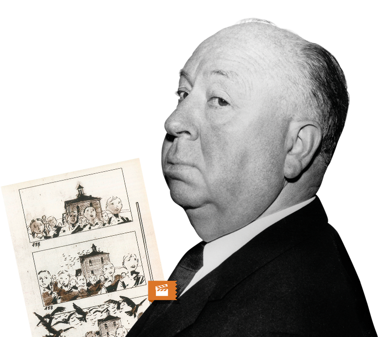
Alfred Hitchcock controlled all creative aspects of his films and constantly visualized his movies. He began with a story or idea and moved quickly to develop a look for the film. Each step in the process had drawings—costume design, production design, set design, visual effects, written scene descriptions, shot lists, storyboards, and camera angles.
Hitchcock envisioned his films in detail before the camera began to roll. His ideas weren’t just written, they were drawn before they were filmed. Careful planning of each scene saved time and production costs.
Storyboarding helps you plan your visuals. Even though it sounds like a tool from the motion picture industry, don’t let storyboarding intimidate you. Many of the concepts work in other forms of storytelling, like presentations. A film maker likes to visualize the entire movie before going into production. They’ll usually tape the storyboard on a wall and begin by looking at the sequence, transitions, and framing—making sure it hangs together structurally, conceptually, and visually.
A storyboard simply helps clarify your idea.
On each film, Hitchcock meticulously planned out shots, camera movement, and even details like the number of birds in the shot and the distance of the camera from the action. Then, a storyboard artist sketched his vision.8
Dan Roam, author of Back of the Napkin, says that, “The person who has the ability to verbally describe a problem has a great talent—but also a great limitation. All the real problems of today are multidimensional, multifaceted, and deeply layered. There is no way to fully understand them—thus no way to effectively begin solving them—without at some point literally drawing them out.”
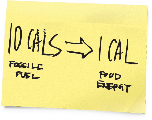
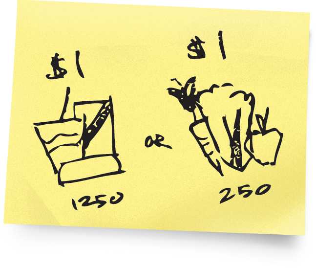
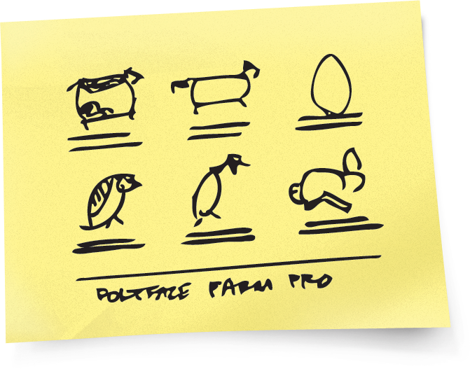
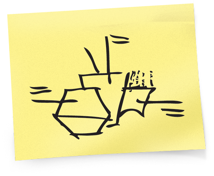
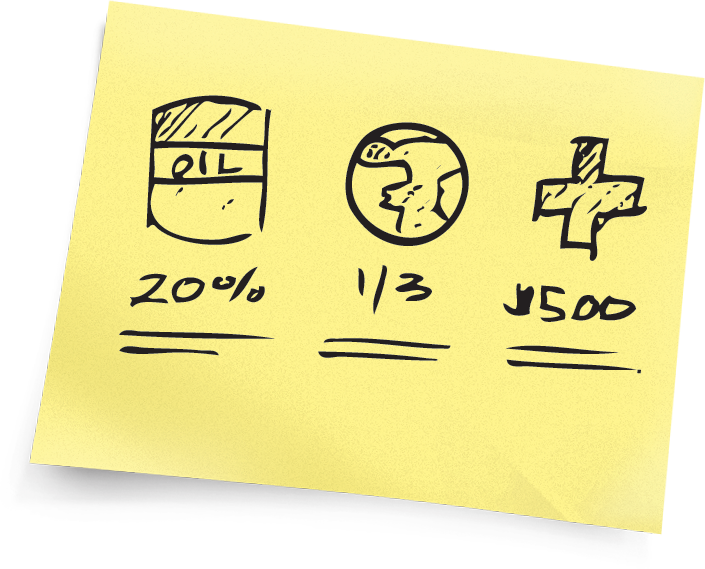
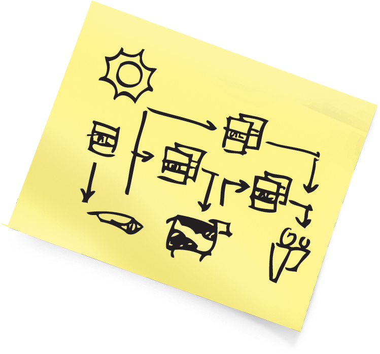
Storyboard on the smallest size sticky note to help constrain how much you put on a slide.
You don’t have to be a talented artist, you
just have to sketch something loose and
quick—doodles, really. This step helps you
see all the visuals in your talk before you
produce them. You’ll be able to tell right
away if your concepts are too complex,
time-consuming, or costly. If so, eliminate them and re-brainstorm a new way to communicate that message.
We all have the capacity to draw. Yet drawing is an undeveloped—and in many organizations unrewarded—skill which makes it hard to be motivated to try.
But try anyway.
Really listen to your verbal
stream and attempt to draw
what you are saying. That
way, others will see it too.
“At our studio we don’t write our stories, we draw them.” Walt Disney
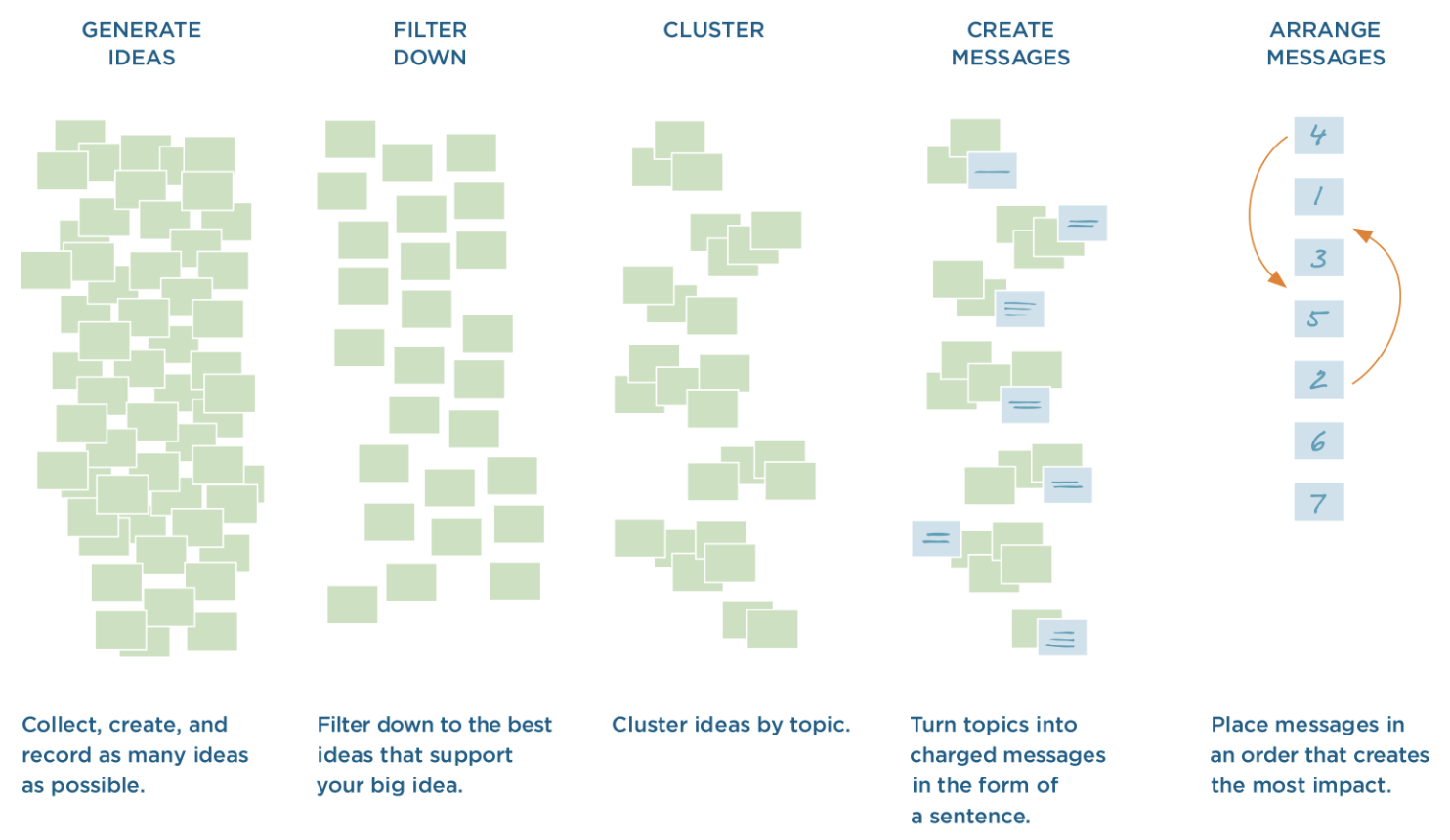
Process Recap
If you’ve been using sticky notes to collect and organize your ideas, this is what the process should look like.
Chapter 6 Review
Review what you’ve learned so far. Each question has one right answer.
In Summary
Everything has inherent structure. A leaf, a building, and even ice cream each have a (molecular) structure. Structure drives the shape and expression of everything. The same is true for presentations. How they are structured determines how they are perceived. Changes to the structure, whether grand or small, alter the receptivity of the content.
To validate the structure, pull your presentation out of the linear slide-making environment and look at the structure spatially and holistically to ensure that it is sound, then arrange the flow for greatest impact.
Structure allows your audience to follow your thought process. If you don’t have clear structure then you end up jumping around and making random connections to ideas that are unclear to the audience. Solid structure causes ideas to flow logically and helps the audience see how the points connect to each other.
Rule #6
Structure is greater than the sum of its parts.
